Thursday, February 20, 2014

EF Circular Slider

An extensible circular slider for iOS applications.

Demo

The code to make this GIF is in the ExampleProject/ directory:

Installation

The simplest way to use EFCircularSlider in your application is with CocoaPods. See the "Getting Started" guide for more information.

Podfile

platform :ios, '7.0'
pod "EFCircularSlider", "~> 0.1.0"
You could instead clone the project and copy the EFCircularSlider/EFCircularSlider.{h,m} files into your project.

Initialization

Adding EFCircularSlider to your project is as simple as getting the source files, and waving a magic wand:
- (void)viewDidLoad {
    ...
    CGRect sliderFrame = CGRectMake(110, 150, 100, 100);
    EFCircularSlider* circularSlider = [[EFCircularSlider alloc] initWithFrame:sliderFrame];
    [self.view addSubview:circularSlider];
    ...
}
And then, just like you would for any other control, you need to subscribe to the event chagning using target-action behavior:
[slider addTarget:self action:@selector(newValue:) forControlEvents:UIControlEventValueChanged];

Options

EFCircularSlider is made to be very easy to style and customize.

Properties

minimumValue:(float) - Default: 0.0f

When the slider is at the very top position, it will set the currentValue to this.
You can set the minimum value with:
circularSlider.minimumValue = 1.0f;

maximumValue:(float) - Default 100.0f

With EFCircularSlider, the currentValue increases as you drag the slider clockwise. Therefore, when the slider is just to the left of the very top position, it will approach (but never reach) this.
You can set the maximum value with:
circularSlider.minimumValue = 100.0f;

currentValue:(float) - Default 0.0f

Whenever the slider changes position, this value will change. It will be a normalized value based on the minimuimValue and maximumValue properties.
You can get the currentValue with:
float val = circularSlider.currentValue;

lineWidth:(int) - Default 5

This determines the width of the arc that makes up the slider. This will set the value both for the unfilled arc (the background) and the arc that shows how much of the slider has been slid across. Currently, changing the lineWidth more than a few pixels causes adverse side effects, mainly with the handle.
You can modify the lineWidth with:
circularSlider.lineWidth = 6;

handleColor:(UIColor*) - Default [UIColor redColor]

The handle is the part of the slider that you drag with your finger.
Modify the color of the handle with:
CGFloat hue = ( arc4random() % 256 / 256.0 );
CGFloat saturation = ( arc4random() % 128 / 256.0 ) + 0.5;
CGFloat brightness = ( arc4random() % 128 / 256.0 ) + 0.5;

circularSlider.handleColor = [UIColor colorWithHue:hue saturation:saturation brightness:brightness alpha:1];

handleType:(EFHandleType) - Default EFSemiTransparentWhiteCircle

EFCircularSlider comes with 4 types of handles:
  • EFSemiTransparentWhiteCircle
  • EFSemiTransparentBlackCircle
  • EFDoubleCircleWithOpenCenter
  • EFDoubleCircleWithClosedCenter
  • EFBigCircle
You can change the handleType with:
circularSlider.handleType = EFDoubleCircleWithClosedCenter;

unfilledColor:(UIColor*) - Default [UIColor blackColor]

This is the color that will show if the slider is set to its minimum value.
You can modify the unfilledColor with:
circularSlider.unfilledColor = [UIColor purpleColor];

filledColor:(UIColor*) - Default [UIColor redColor]

This is the color that will show between the minimum value and the currentValue.
You can modify the filledColor with:
circularSlider.unfilledColor = [UIColor purpleColor];

labelFont:(UIFont*) - Default [UIFont systemFontOfSize:10.0f]

This is the font that the labels will have if you decide to set inner marking labels (more on this down the page).
You can modify the labelFont with:
circularSlider.labelFont = [UIFont systemFontOfSize:14.0f];
Note this will have no effect if you have not passed in the labels that you want to add

snapToLabels:(BOOL) - Default NO

If this is set to YES, once finish dragging the slider, it will snap to the closest label and subsequently set the current value to what it would be at that label, not where you dragged it.
You can set the slider to snap to labels with:
circularSlider.snapToLabels = YES;
Note this will have no effect if you have not passed in the labels that you want to add

Functions

-(void)setInnerMarkingLabels:(NSArray*)labels

You can send this method an array of labels and they will show up on the inside of the slider. There is currently no way to specify the spacing between the labels and therefore they will be evenly spaced out. If you choose to include labels on your slider, you will then have the option to set the font of the label as well as if the slider should snap to the closest label position after the value changes.
The first label will appear at the 1 o'clock position (if it were a clock).
If you wanted to make your slider look like a clock, you would do the following:
NSArray* hoursArray = @[@"1", @"2", @"3", @"4", @"5", @"6", @"7", @"8", @"9", @"10", @"11", @"12"];
[circularSlider setInnerMarkingLabels:hoursArray];
Download: https://github.com/eliotfowler/EFCircularSlider/archive/master.zip

Wednesday, February 19, 2014

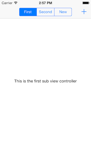
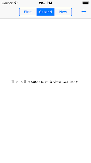
FH Segmented View Controller

FHSegmentedViewController

123

Requirements

  • iOS 6.1+
  • ARC

Installation

From CocoaPods

pod 'FHSegmentedViewController'

From source

  • Drag the FHSegmentedViewController folder to your project

Getting Started

  1. Create a subclass of FHSegmentedViewController in your project
#import "FHSegmentedViewController.h"

@interface MasterViewController : FHSegmentedViewController
2.Implement - (void)viewDidLoad
- (void)viewDidLoad
{
    [super viewDidLoad];

    [self setViewControllers:@[[self.storyboard instantiateViewControllerWithIdentifier:@"firstSubViewController"], [self.storyboard instantiateViewControllerWithIdentifier:@"secondSubViewController"]]];
}
  1. Push an instance of AnotherViewController.
    UIViewController *viewController = [self.storyboard instantiateViewControllerWithIdentifier:@"firstSubViewController"];
    [self pushViewController:viewController title:@"anotherViewController"]; 
Download: https://github.com/iDay/FHSegmentedViewController/archive/master.zip

Sunday, February 16, 2014

MW Date Picker

MWDatePicker - Custom UIDatePicker

An UIDatePicker replacement with custom Background and Selector Styles. (As seen in nextr)

Still in work :)

Preview

With Shadows and ColorsWith Shadows and BlackWith Shadows and Black and SelectorWithout Shadows and White

Features

  • customize the Look and Feel of your UIDatePicker in order to suit your App Design
  • change Background of each Component either with UIColor or an UIView
  • change and style the Date Selector Overlay (again with UIColor or an UIView)

Installation

  1. Add MWDatePicker.h and MWDatePicker.m to your project
  2. Add QuartzCore.framework to your project

Requirements

  • iOS 6.0 and greater
  • ARC

Delegate Methods

  1. Add 'MWDatePicker.h' to your ViewController
  2. Add 'MWPickerDelegate' to your Class
  3. Implement MWDatePicker Delegate Methods
  • (void)datePicker:(MWDatePicker *)picker didSelectRow:(NSInteger)row inComponent:(NSInteger)component;
  • (void)datePicker:(MWDatePicker *)picker didClickRow:(NSInteger)row inComponent:(NSInteger)component;
  • (UIView *)backgroundViewForDatePicker:(MWDatePicker *)picker;
  • (UIColor *)backgroundColorForDatePicker:(MWDatePicker *)picker;
  • (UIView *)datePicker:(MWDatePicker *)picker backgroundViewForComponent:(NSInteger)component;
  • (UIColor *)datePicker:(MWDatePicker *)picker backgroundColorForComponent:(NSInteger)component;
  • (UIView *)overlayViewForDatePickerSelector:(MWDatePicker *)picker;
  • (UIColor *)overlayColorForDatePickerSelector:(MWDatePicker *)picker;
  • (UIView *)viewForDatePickerSelector:(MWDatePicker *)picker;
  • (UIColor *)viewColorForDatePickerSelector:(MWDatePicker *)picker;
Download: https://github.com/mwermuth/MWDatePicker/archive/master.zip

Friday, February 14, 2014

CR Navigation Controller

A UINavigationController subclass that brings about a more vivid, brighter UINavigationBar.
iOS 7.1 Update: This update has yet again affected how UINavigationBar's color scheme works. This time, it seems as though any modifications to the alpha channel are ignored. This hinders this library quite a bit since we rely on editing this value to display the color layer beneath. I am currently looking for a workaround for this.
iOS 7.0.3 Update: It seems like this update has changed the way translucency works for both navigation bars and toolbars. The blurriness is dependant on the alpha of the color. Unfortunately, there is no magic formula to make colors made in iOS 7.0.2 and earlier the same as they are in iOS 7.0.3. I've found that setting the alpha of the navigation bar at around 0.6f-0.8f provides the best bang for your buck; that is, you can still obtain translucency, however, at the cost of your vibrant color. The additional color layer has been removed since this also impacts translucency, until we can figure out a more optimal solution. If you are still running an earlier version of iOS 7, this library still works!
With the release of iOS 7, Apple has brought translucency all throughout the operating system. As developers, we are (in a sense) responsible for utilizing these new libraries to present unity between our apps and the OS. With the introduction of gaussian, translucent navigation bars, we are able to allow for more dynamic context with the views that we are presenting.
However, there's a subtle flaw; much of the color options are rather desaturated. Suppose you wanted a translucent navigation bar that was a slightly light, rich blue. With native classes, you would get this (under a white background):

Blue UINavigationBar without Layer

Not exactly what you'd expect. You could come up with a combination of values for red, green, and blue and still never get the color you wanted. This is because Apple has decided to lower the saturation of the color by about 40%. Additionally, it inherits some color from whatever is behind it. As a result, we get this very pale blue color that isn't necessarily what we want.
Enter this library.
This library does a simple little addition to the UINavigationBar. By adding a layer directly above the navigation bar's background layer, we can enhance the navigation bar's vibrance. This layer takes on the same color that we specify in the navigation bar's barTintColor, at 50% opacity. This can be changed, but I've found that this percentage is the best blend of vibrance and translucency. With this library, we get:

Blue UINavigationBar with Layer

This still doesn't allow us to achieve an absolute color; however, it brings us many steps closer in the right direction.

UINavigationController vs. CRNavigationController:

Achieving a red barTintColor:

Red UINavigationBar without Layer
vs.
Red UINavigationBar with Layer

Achieving a black barTintColor:

Black UINavigationBar without Layer
vs.
Black UINavigationBar with Layer

Requirements

  • Xcode 5
  • iOS 7.0 (iOS 7.0.3 has a different color scheme. So does iOS 7.1.)
  • A desire to experiment with colors!

Demonstration

A demo app is available in the repo. Mess with the toggles to change the color of either the CRNavigationBar or the backgroundColor of the view to understand how much impact a specific color may have on a certain barTintColor. RGB values in decimal format are also displayed for your convenience if you decide to use this as a tool to find the perfect color.

Credits, Licensing, and Other What Have You

I can't take all of the credit for this solution. This was a collaborated effort on Stack Overflow, created by me and many others. Feel free to use this library in your projects. Mess with the settings and find what blends work best with your apps! I only ask that you leave boilerplates unchanged and that you mention the use of this library in any apps you decide to ship into the store.
I guess this goes here, too. The infamous MIT License:
Permission is hereby granted, free of charge, to any person obtaining a copy of this software and associated documentation files (the "Software"), to deal in the Software without restriction, including without limitation the rights to use, copy, modify, merge, publish, distribute, sublicense, and/or sell copies of the Software, and to permit persons to whom the Software is furnished to do so, subject to the following conditions:
The above copyright notice and this permission notice shall be included in all copies or substantial portions of the Software.
Download: https://github.com/croberts22/CRNavigationController/archive/master.zip

Thursday, February 13, 2014

DL Widget Menu

DLWidgetMenu is a versatile solution for displaying widget menus and can easily be extended with custom layouts and/or animations.

Preview

screenshot

Features

DLWidgetMenu comes with three built-in layouts:
  • DLWMLinearLayout
  • DLWMRadialLayout
  • DLWMSpiralLayout
DLWidgetMenu uses iOS7's spring animations (DLWMSpringMenuAnimator) by default, but can easily be provided with your own custom animations as well (by subclassing DLWMMenuAnimator).
DLWidgetMenu observes its menu items for these gesture recognizer events:
  • single tap
  • double tap
  • long press
  • pan
  • pinch
and forwards them directly to its delegate.
None of these events make DLWidgetMenu do anything by default.
The menu (by default) doesn't even open, when you tap it!
And it shouldn't.
DLWidgetMenu was specifically designed to keep you in full control over its behaviour. All it does is animating and layouting its menu items. Keeping you in total charge of what to do and when.
Assuming you do want DLWidgetMenu to open when single-tapped, all you need to do is implement this in your DLWMMenuDelegate:
- (void)receivedSingleTap:(UITapGestureRecognizer *)recognizer onItem:(DLWMMenuItem *)item inMenu:(DLWMMenu *)menu {
    if ([menu isClosedOrClosing]) {
        [menu open];
    } else if ([menu isOpenedOrOpening]) {
        if (item == menu.mainItem) {
            [menu close];
        } else {
            [menu closeWithSpecialAnimator:[[DLWMSelectionMenuAnimator alloc] init] forItem:item];
        }
    }
}
As you can see the delegate makes DLWidgetMenu use a custom animator for the tapped menu item by calling:
[menu closeWithSpecialAnimator:[[DLWMSelectionMenuAnimator alloc] init] forItem:item];
(The built-in DLWMSelectionMenuAnimator applies a scale-up in combination with a fade-out.)
Don't want that? Fine, just call [menu close]; then.
Okay, tapping is pretty standard stuff, right? Nothing too fancy. So how about moving a menu around using a pan gesture? Piece of cake:
- (void)receivedPan:(UIPanGestureRecognizer *)recognizer onItem:(DLWMMenuItem *)item inMenu:(DLWMMenu *)menu {
    // NSLog(@"%s", __FUNCTION__);
    if (item == menu.mainItem) {
        [menu moveTo:[recognizer locationInView:menu.superview] animated:NO];
    }
}

It's worth mentioning here that one should usually prefer [menu moveTo:… animated:…]; over menu.center = …; (while the menu is open, that is).
The reason for this is that DLWidgetMenu shrinks to just wrap its main item when closed and stretches to fit its superview when opened (in order to catch tap events outside its menu items). Just enable the debugging-mode (menu.debuggingEnabled = YES;) and you should get an idea of what this means.

Installation

Just copy the files in "DLWidgetMenu/Classes/..." into your project.
Alternatively you can install DLWidgetMenu into your project with CocoaPods. Just add it to your Podfile:
pod 'DLWidgetMenu'

Demos

DLWidgetMenu contains a demo app giving you a quick overview of all three included layouts.

ARC

DLWidgetMenu uses automatic reference counting (ARC).

Download: https://github.com/regexident/DLWidgetMenu/archive/master.zip

Tuesday, February 11, 2014

AP Time Zones

An utility for iOS and OSX developers to simplify extracting NSTimeZone from a given CLLocation.
You can do the same job by calling Google API or Yahoo API but APTimeZones works locally, offline and with no limits inherented to hosted solutions.

Usage:

//Ukraine location
CLLocation *location = [[CLLocation alloc] initWithLatitude:50.449846
                                                  longitude:30.523629];

NSTimeZone *timeZone = [[APTimeZones sharedInstance] timeZoneWithLocation:location];
NSLog(@"%@", timeZone);
You can use APTimeZones with Apple CLGeocoder as well to receive NSTimeZone for a given city string.
CLGeocoder *geocoder = [[CLGeocoder alloc] init];
[geocoder geocodeAddressString:@"New York" completionHandler:^(NSArray *placemarks, NSError *error) {
    if (placemarks.count) {
        CLPlacemark *placemark = placemarks[0];
        CLLocation *location = placemark.location;

        NSString *countryCode = placemark.addressDictionary[@"CountryCode"];
        NSTimeZone *timeZone = [[APTimeZones sharedInstance] timeZoneWithLocation:location
                                                                      countryCode:countryCode];
        NSLog(@"%@", timeZone);
    } 
}];

Version 1.1:

We've added some handy categories with version 1.1 to make timezones magic even more easy.
CLLocation+APTimeZones
CLPlacemark+APTimeZones
Usage:
CLLocation *location = ...
NSLog(@"%@", location.timeZone);

CLPlacemark *placemark = ...;
NSLog(@"%@", placemark.timeZone);
Also, we've added example project that shows APTimeZones usage [Demo Video on YouTube]:
githalytics.com alpha If you have improvements or concerns, feel free to post an issue and write details.

Download: https://github.com/Alterplay/APTimeZones/archive/master.zip

Friday, January 24, 2014

3D Sphere View

Introduction:
- Implementation can be automatically or manually rotate the rotating 3D spherical tab, click the tab to enlarge the label.
- Code reference
http://codeiospro.blogspot.com
- Xiaobian Note: Thanks to developer @ supernatural apparition release code in http://codeiospro.blogspot.com.
Test environment:
- [CodeIOSpro] compile the test, the test environment: Xcode 5.0, iOS 5.0 above.


3D Sphere View iOS / iPhone / iPad 3D Sphere View iOS / iPhone / iPad  

Download: https://github.com/heroims/SphereView/archive/master.zip

Thursday, January 23, 2014

Twitter Cover

Twitter Cover is a parallax top view with real time blur effect to any UIScrollView, inspired by Twitter for iOS.
Completely created using UIKit framework.
Easy to drop into your project.
You can add this feature to your own project, TwitterCover is easy-to-use.

Requirements

TwitterCover requires Xcode 5, targeting either iOS 5.0 and above, ARC-enabled.

How to use

Drag UIScrollView+TwitterCover.h amd UIScrollView+TwitterCover.m files to your project.
No other frameworks required.
#import "UIScrollView+TwitterCover.h"
UIScrollView *scrollView = [[UIScrollView alloc] initWithFrame:self.view.bounds];
[scrollView addTwitterCoverWithImage:[UIImage imageNamed:@"cover.png"]];

How it looks

Twitter Cover iOS / iPhone / iPad

Download: https://github.com/cyndibaby905/TwitterCover/archive/master.zip

Wednesday, January 22, 2014

RF Keyboard Toolbar

This is a flexible UIView and UIButton subclass to add customized buttons and toolbars to your UITextFields/UITextViews. This project was inspired by the toolbar seen in iOctocat.

Installation

Installation with CocoaPods

CocoaPods is a dependency manager for Objective-C, which automates and simplifies the process of using 3rd-party libraries like RFKeyboardToolbar in your projects.

Podfile

platform :ios, '7.0'
pod "RFKeyboardToolbar", "~> 1.1"

Installation without CocoaPods

Just drag the RFKeyboardToolbar folder into your project and import it.
#import 'RFKeyboardToolbar.h'

Use

RFKeyboardToolbar is pretty easy to use with your UITextFields or UITextViews. After you've importedRFKeyboardToolbar, you can add a toolbar to anything that has an inputAccessoryView.
I've commented on the initialization below, to help you get a better understanding of it.
// Create a new RFToolbarButton
RFToolbarButton *exampleButton = [RFToolbarButton buttonWithTitle:@"Example"];

// Add a button target to the exampleButton
[exampleButton addEventHandler:^{
    // Add any action
    [_textView insertText:@"You pressed a button!"];
} forControlEvents:UIControlEventTouchUpInside];

// Create an RFKeyboardToolbar, adding all of your buttons, and set it as your inputAcessoryView
_textView.inputAccessoryView = [RFKeyboardToolbar toolbarViewWithButtons:@[exampleButton]];

// Add the UITextView/UITextField   
[self.view addSubview:_textView];
Hope you enjoy it! Please Fork and send Pull Requests!

Screenshots

RFMarkdownTextViewRFKeyboardToolbarDemo

Contributors

License

The MIT License (MIT)
Copyright (c) 2013 Rex Finn
Permission is hereby granted, free of charge, to any person obtaining a copy of this software and associated documentation files (the "Software"), to deal in the Software without restriction, including without limitation the rights to use, copy, modify, merge, publish, distribute, sublicense, and/or sell copies of the Software, and to permit persons to whom the Software is furnished to do so, subject to the following conditions:
The above copyright notice and this permission notice shall be included in all copies or substantial portions of the Software.
Download: https://github.com/rexfinn/RFKeyboardToolbar/archive/master.zip

Tuesday, January 21, 2014

Face Aware Fill

This category applies Aspect Fill content mode to an image and if faces are detected it centers them instead of centering the image just by its geometrical center.
Based on this awesome post by @maniacdev

Example:

image

Installation

FaceAwareFill is available through CocoaPods, to install it simply add the following line to your Podfile:
pod "FaceAwareFill"

Usage

Import the category to your .m file or to your "prefix" file.
#import "UIImageView+UIImageView_FaceAwareFill.h"
Then AFTER setting the image property of a UIImageView do:
[imageView faceAwareFill];
That's all.
Enjoy!

Debugging

A red rectangle can optionally be displayed on faces for debugging.
To enable, add the following value to the preprocessor macros:
DEBUGGING_FACE_AWARE_FILL

Author

Julio Andrés Carretttoni, @dev_jac

Notes:

Face Aware Fill Face Aware Fill Download: https://github.com/Julioacarrettoni/UIImageView_FaceAwareFill/archive/master.zip

Friday, January 17, 2014

Progress HUD

ProgressHUD is a lightweight and easy-to-use HUD for iOS 7 (written in Objective-C).

Installation

Drag the ProgressHUD/ProgressHUD folder into your project.

Requirements

  • Xcode 5
  • iOS 7
  • ARC

Displaying the HUD

+ (void)show:(NSString *)status;
+ (void)showSuccess:(NSString *)status;
+ (void)showError:(NSString *)status;
showSuccess and showError will automatically dismiss the HUD.

iOS / iPhone / iPad 适配iOS 7的HUD。 iOS / iPhone / iPad 适配iOS 7的HUD。 iOS / iPhone / iPad 适配iOS 7的HUD。 iOS / iPhone / iPad 适配iOS 7的HUD。

Dismissing the HUD

+ (void)dismiss;

Usage

1., Add the following import to the top of the file:
#import "ProgressHUD.h"
2., Use the following to display the HUD:
[ProgressHUD show:@"Please wait..."];
3., Simply dismiss after complete your task:
[ProgressHUD dismiss];

Color shemes

Use sheme_white or sheme_black depending on your needs. However feel free to customize the color settings in ProgressHUD.h file.

Download: https://github.com/relatedcode/ProgressHUD/archive/master.zip

Thursday, January 16, 2014

iOS Mp4 Camera

A Demo WIth UIIamgePicerView and AVAssetExportSession

Attenction This Demo Based iOS 6 SDK...

This demo shows:

  1. Record a Mov Video
  2. Convert To Mp4 File With Native API
  3. Play The Mp4 File With MPMoviePlayerViewController
 iOS Mp4 Camera iOS / iPhone / iPad

Download: https://github.com/rpplusplus/iOSMp4Camera/archive/master.zip